Lessing-Flynn has been in the business of big ideas since 1907. This guide exists so that every touchpoint — every headline, every color choice, every photograph — reflects the same fearless, craft-obsessed agency we’ve always been.
What follows is not a rulebook. It’s a set of convictions. Use them to think, create and communicate like Lessing-Flynn.
Who We Are
“Clever catalyst.”
A charismatic partner that sparks bold growth through sharp wit and fearless curiosity — igniting brands with ideas that move audiences to action.
How We Sound
“Clever and confident — but not quite cocky.”
Sharp. Witty. Unafraid. We say what we mean and mean something when we say it.
What We Do
“Creatively solving complex brand challenges.”
Independently owned. Deeply invested. We treat every client’s problem like it’s our own — because it is.
Why We Do It
“Empowering brands that do good in the world.”
We work with brands where the work matters beyond the bottom line. Not altruism — just how we do our best work.
Logo
The Lessing-Flynn wordmark is inspired by our past and the history of our industry. When Paul Lessing published The Melting Pot in 1911, he set out a conviction that good ideas, clearly expressed, have the power to move people to action. That hasn’t changed.
The wordmark is set in Caslon — a typeface with deep roots in American history — because the name deserves type with the same weight of legacy behind it. No icon. No emblem. Just the name, standing on its own, as it has for over a century.
On White
On Black
Clear Space
Always maintain a minimum clear space around the wordmark equal to the height of the “L” on all sides — measured from the cap height above, the baseline below and the outer stems of the first and last letters on each side. Note that letter descenders will extend into this space. This zone must remain free of all other elements, text and imagery.
Do’s & Don’ts
✓ Do
Use the wordmark at full resolution on clean, high-contrast backgrounds.
✕ Don’t
Don’t distort, stretch, skew or alter the wordmark’s proportions.
✓ Do
Use the inverted (white) version on dark and photographic backgrounds.
✕ Don’t
Don’t recolor, add outlines, drop shadows or apply effects.
✓ Do
Reproduce the wordmark at sizes where all letterforms remain legible.
✕ Don’t
Don’t scale the wordmark so small the letterforms become illegible. Use the quill mark instead.
Typography
Three typefaces. Each with a distinct role. Together they build a voice that is simultaneously historic and immediately legible — heritage with purpose, craft with precision.
HWT Unit Gothic — Headlines, Subheads, Graphic Elements
Ideas That Move People.
HWT Unit Gothic anchors the Lessing-Flynn visual voice. Its industrial origins — rooted in wood-type letterpress printing of the late 1800s — align with the agency’s heritage. Use it bold, big and uppercase. At small sizes with generous tracking, it works as a label and caption face.
Available Widths
716 — ExtendedLessing-Flynn
717Lessing-Flynn
718 — PrimaryLessing-Flynn
719Lessing-Flynn
720Lessing-Flynn
721Lessing-Flynn
722 — CondensedLessing-Flynn
Akzidenz-Grotesk Next — Body Copy, Subheads, Readable Text
Founded in 1907, Lessing-Flynn is the longest-standing independently owned advertising agency in America. We help clients solve complex brand challenges, producing award-winning work across a variety of industries.
Akzidenz-Grotesk Next is our workhorse — a refinement of one of the most influential sans-serifs ever designed, predating Helvetica by decades. It carries the same rational clarity with more warmth. Use it for all body copy, readable subheads, captions and UI text.
Regular — PrimaryThe quick brown fox.
BoldThe quick brown fox.
Regular ItalicThe quick brown fox.
Bold ItalicThe quick brown fox.
Scotch Text — Graphic Elements, Select Headlines (Sparingly)
“Charged up with big ideas.”
Scotch Text brings editorial elegance and historical character. Think 19th-century newspaper mastheads and book titles. Use it for pull quotes, typographic accents and moments when copy deserves a stage. Never for body copy or UI.
Hierarchy in Practice
Label — Akzidenz / 10px / tracking +250
Big Idea Headline
Subhead — Akzidenz / 22px / 400
A supporting statement that frames the idea.
Body — Akzidenz / 17px / 400 / 1.7 leading
Supporting copy that delivers the full idea with warmth and precision. Readable, purposeful, never decorative.
Color
Lessing-Flynn lives in black and white — clean, authoritative, timeless. Color is a tool, not a decoration. When it appears, it commands attention precisely because it’s earned its place on the page.
Accent colors appear one at a time. Never two together on the same page. Think of each as a spotlight, not a floodlight.
Primary Palette
Black
#000000
RGB 0 / 0 / 0
CMYK 0 / 0 / 0 / 100
White
#FFFFFF
RGB 255 / 255 / 255
CMYK 0 / 0 / 0 / 0
Accent Palette
Rotate through the accent palette across campaigns and contexts. Never use two accents together. Each color should feel like a deliberate choice, not one of many options.
Signature
LF Orange
#FA7201
RGB 250 / 114 / 1
CMYK 0 / 55 / 100 / 0
Accent 1
Electric Blue
#1A6BFF
RGB 26 / 107 / 255
CMYK 100 / 50 / 0 / 0
Accent 2
Catalyst Green
#00B84A
RGB 0 / 184 / 74
CMYK 65 / 0 / 100 / 0
Accent 3
Signal Red
#FF2458
RGB 255 / 36 / 88
CMYK 0 / 95 / 53 / 0
In Use — Full-Bleed Color Blocks
Accent colors work as full-bleed blocks with white text. They do not appear as tints, gradients or combinations. One per page. One at a time.
LF Orange
Big ideas. Bold color.
Electric Blue
Charged up. Always.
Catalyst Green
Since 1907.
Signal Red
The last agency you’ll need.
Photography
Good photography is honest. Lessing-Flynn imagery avoids the artificial — no stiff poses, no generic stock, no heavy-handed retouching. Whether we’re shooting our people, capturing work in the wild or documenting a client’s world, the goal is the same: images that feel real, immediate and worth a second look.
Natural light. Authentic moments. Compositions that leave a little room to breathe.
Our People.
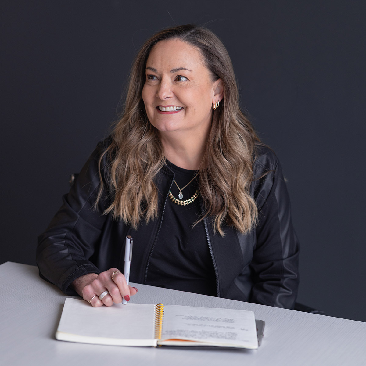
Our people are the proof of our culture — curious, forward-thinking and genuinely all in. Portraits are direct and confident, not posed or performative. Off-center framing, natural light and authentic moments over studio setups.
Dynamic & Editorial.
Beyond people, Lessing-Flynn photography captures energy in motion — objects, environments, action, texture. These images should feel mid-thought: imperfect, immediate, interesting.
Portfolio & Work.
Client work and co-brand photography should demonstrate craft and strategic intent. Show the work in context — in the wild, on screen, in print. Not in a vacuum.
✓ Do’s
Natural light or light that feels natural
Authentic, un-posed moments
Off-center compositions
High contrast, clean blacks
Subjects engaged, not performing
Context and environment in frame
✕ Don’ts
Heavy filters or over-processed edits
Staged group “we’re a team!” shots
Generic stock photography
Lens flare, HDR, heavy vignetting
Low resolution or soft images
Busy, cluttered backgrounds
Graphic Elements
The Lessing-Flynn graphic language extends beyond the wordmark. A small set of supporting elements — the quill symbol, typographic marks, ruled lines and the year stamp — give our brand visual texture and depth without competing with the work itself.
Use these elements with intention. They reinforce the brand’s personality when applied well, and undermine it when overused.
The Quill.
The quill mark is Lessing-Flynn’s graphic symbol — a nod to the ink-stained origins of the advertising trade and the craft of writing that has always powered great creative work. Before digital, before television, before radio, there was a person with an idea and a pen. The quill honors that lineage.
It appears in three forms. Use it as an accent element, compositional anchor or texture. On smaller applications — attire, merchandise, tight spaces where the wordmark can’t breathe — it can stand alone. It is not a substitute for the full wordmark where formal brand identification applies.
Black
Light backgrounds
White
Dark backgrounds
Orange
Accent / emphasis
✓ Appropriate Uses
Standalone mark in social avatars or app icons
Section divider or bullet graphic
Large-scale background texture element
Embossed or debossed on print collateral
Standalone on branded attire and merchandise
Paired with the wordmark in lockup compositions
✕ Never Do This
Use in place of the full wordmark as primary ID
Recolor beyond the three approved variants
Add shadows, bevels, glows or effects
Stretch, skew, rotate or distort the form
Use orange on a low-contrast background
Data Visualization
When data enters the story it follows the same discipline as everything else: clarity over decoration. Strip away gridlines, legends that duplicate labels and colors that exist for variety alone. A limited palette — shades of black and gray for supporting data, LF Orange reserved for the number that matters — keeps charts legible and unmistakably on brand. Let the shape of the data do the work.
Avg. Engagement Rate by Channel — Q4 2024
2.2%
Display
4.3%
Search
5.1%
Social
7.2%
Direct
8.4%
Email
New Client Revenue — 2020–2024
$3.2M
2020
$4.8M
2021
$6.7M
2022
$8.1M
2023
$9.6M
2024
2024 Media Mix
Audience Funnel
Typographic Elements
Beyond the quill, the brand’s graphic language is built from type. Year marks, rule lines, label caps and large-scale headline treatments are all graphic elements. HWT Unit Gothic at scale, used boldly and with restraint, is itself a design tool.
Year Stamp — Outline
1907
Label + Rule + Headline
Section Label
Headline Treatment
Voice & Tone
Lessing-Flynn’s voice is the product of over a century of talking to business owners, brand managers and marketing directors who’ve seen enough agency swagger to know when it’s real and when it’s not. Ours is real.
We’re clever — but not precious about it. Confident — but quick to laugh at ourselves. We never brag without earning it first.
“We are quite possibly the last ad agency you’ll ever need.”
Clever: makes the reader reflect on every agency before. Confident: states the fact plainly. Not cocky: “quite possibly” keeps it playful.
The Spectrum
✓ We Sound Like This
“Product launching since 1907.”
“Give us a marketing challenge and we’ll get you charged up with big ideas that power your brand forward.”
“Our core values are more refreshing than a gulp of Ice-T.”
✕ We Don’t Sound Like This
“Our integrated marketing solutions leverage synergistic brand ecosystems to drive KPI-forward outcomes at scale.”
“We are a full-service agency with decades of experience serving clients across multiple verticals.”
“We are very excited to announce our new partnership with…”
Voice Principles
1
Say It Once
If you’ve made your point, stop. Repetition is not emphasis — it’s insecurity dressed up as thoroughness.
2
Earn the Wit
Every clever turn of phrase should have a point. We don’t joke for the sake of joking — we joke to make an idea land harder.
3
Be Direct
Agency jargon is the enemy. Say what you mean in plain language. Our clients are smart — talk to them that way.
4
Stay Curious
Every great headline started with a question. Curiosity isn’t a personality trait — it’s the first step in the creative process.
5
Own the History
1907 is not a number. It’s credibility. Proof. Earned authority no other agency in America can claim. Use it with pride — not nostalgia.
6
All In
Our people. Our clients. Our communities. When we say all in, it shows in everything — the work, the words, the relationships. That’s a standard, not a slogan.
Brand Roadmap
A brand is never finished.
What you're reading is the foundation — the mark, the voice, the principles that define who Lessing-Flynn is. But a complete brand system includes more than what's here today. The assets below are in active development. Each one represents a strategic expansion of the LF identity, moving from core mark to full brand ecosystem. As they are finalized, they will be added to this guide.
Things to Come
Logo Variations
An extended family of logo lockups for diverse applications — horizontal, stacked and icon-only configurations across all approved color combinations.
Icons
A proprietary icon library drawn in the LF visual language, designed for use across digital interfaces, presentations and motion graphics.
Video Elements
Branded motion templates including opens, lower thirds, transitions and end cards — built to support consistent storytelling across all video channels.
Sonic Branding
An audio identity for LF: a sonic logo and brand sound system for use in broadcast, digital content and experiential environments.